Recently, I found myself grappling with some data presented in a series of reports that seemed to contradict common sense. Feeling overwhelmed, I turned to my friend Jeremy, an experienced statistician from the UK, for help. As he patiently walked me through the nuances of the data, I realized how easily I could have been misled by the superficial conclusions drawn in those reports. His insights illuminated the importance of critical thinking in interpreting statistics, and I was grateful for his guidance.
Recognizing the value of Jeremy’s expertise, I decided to invite him for an interview to share his thoughts on the misuse of statistics, particularly in political contexts. Thankfully, he agreed, and I’m excited to delve deeper into his perspective on how data can be manipulated and the critical role of statisticians in promoting accurate interpretations. I encourage you to read interview bellow, as it offers valuable insights into the complexities of data analysis and underscores the critical importance of statistical literacy in our information-saturated world. Jeremy’s perspective will undoubtedly provide a fresh take on how we can all become more adept at questioning and interpreting the numbers we come across every day.
1. Can you provide specific examples of how statistics have been misused in political campaigns?
Absolutely, there are numerous examples where statistics have been misused in political campaigns, and it really frustrates me. One classic case is during discussions about unemployment rates. Politicians often highlight a percentage decrease in unemployment to showcase their success, but they frequently omit crucial context. For instance, during the aftermath of the 2008 financial crisis, some politicians pointed to a drop in unemployment rates without mentioning that the overall labor force had shrunk significantly due to people dropping out of the workforce entirely. This gives a misleading impression of economic health and recovery.
Another common tactic is cherry-picking data. A notable example was seen in the debates surrounding the Affordable Care Act in the U.S. Supporters often cited studies showing that the number of uninsured Americans dropped after its implementation. However, critics pointed out that these statistics didn’t account for the rising premiums and deductibles that many individuals faced, which created a skewed narrative about the law’s overall effectiveness.
Additionally, during Brexit, various campaigns used statistics to support their arguments. For instance, the Leave campaign famously claimed that the UK sends £350 million a week to the EU, suggesting that this money could be better spent on the National Health Service. However, this figure was misleading, as it didn’t account for the rebate the UK received, nor did it consider the economic benefits of EU membership.
These examples illustrate how statistics can be manipulated to sway public opinion and influence voting behavior. It’s vital for the public to understand these tactics to make informed decisions, which is why I have a bit of a grudge against those who misuse statistics for political gain. It undermines trust in data and can lead to misguided policies that affect everyone.
2. What are the most common tactics politicians use to manipulate statistical data to support their agendas?
Politicians, have an arsenal of statistical tricks that might make your head spin if you’re not paying attention. I’ll list a few of the most common tactics they use to manipulate data for their agendas:
- Cherry-picking data: This is a classic. They’ll focus on the stats that support their point and conveniently ignore the rest. It’s like reporting that crime is down in your city… by only looking at one quiet neighborhood. The full picture? Probably not so rosy.
- Misleading averages: Politicians love to throw around averages, but they often don’t tell you which type of average they’re using. Take income, for example: the mean might suggest wealth is growing, but that’s skewed if the super-rich are getting richer while the rest of us are stagnating. The median, which shows the middle value, might tell a very different story.
- Using percentages out of context: “Crime has risen by 200%!” Sounds terrifying, doesn’t it? But if there was one incident last year and three this year, that’s a 200% increase. Context, folks—context matters.
- Confusing correlation with causation: Just because two things happen together doesn’t mean one caused the other. Ice cream sales go up in summer, and so do drownings. Does that mean ice cream causes drowning? Of course not! But you’d be surprised how often politicians exploit this fallacy to connect unrelated dots.
- Ignoring sample size: A politician will proudly wave a survey result from 1,000 people, but if the population is 60 million, that’s a drop in the ocean. Even worse if the sample is biased or unrepresentative—like only surveying people from one demographic.
- Time frame manipulation: Want to show progress on unemployment? Just compare the numbers from last week to the previous week, and voilà—things look great! But if you zoom out to the last five years, a different trend might emerge. The trick is to pick the window that best supports their narrative.
- Omitting inconvenient data: This one really gets me. They’ll present a positive stat but leave out the accompanying negative. For example, “Wages have increased by 4%!”—without mentioning inflation has risen by 6%, meaning people are actually worse off.
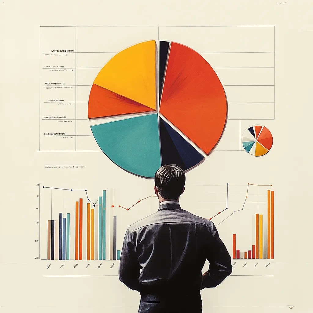
- Graphical manipulation: Don’t even get me started on dodgy graphs. Y-axis manipulation, truncated scales, or even just flipping the axes are common tricks to make a tiny change look monumental—or vice versa. A well-chosen graph can make a small dip look like a freefall or a modest rise look like an economic boom.
So, next time you see a politician spouting numbers, take a deep breath and remember: the devil’s in the details. If it sounds too good (or too bad) to be true, it probably is. And for the love of stats, check the source!
3. How can the public better identify when statistics are being misrepresented in political discourse?
Many politicians, particularly those with less scrupulous intentions, are aware that most people lack the time or resources to thoroughly analyze statistical data. As a result, they often rely on the assumption that voters will accept statistics at face value without questioning their validity. However, it’s essential to approach these figures with a critical mindset. Here are a few tips to help you navigate the statistical landscape more effectively:
- Don’t fall for ‘big numbers’ without perspective:Politicians love throwing around massive figures to impress or scare the public. “We’ve invested £1 billion in healthcare!” sounds like a big deal, but is it? Ask yourself: How does this compare to previous spending or to the size of the overall budget? £1 billion might be a drop in the ocean if the total budget is £100 billion. Always look at the numbers in context.
- Look for outliers: Sometimes, a politician will focus on a single extreme data point to make their case. You know the type: “Crime is rising in this area!” or “Wages have shot up by 10% in this industry!” But these outliers might not reflect the larger trend. Be wary of conclusions drawn from unusual cases or isolated examples. Ask yourself: Is this part of a broader pattern, or just an exception?
- Beware of relative risks vs. absolute risks: This one’s sneaky. If a politician says, “This policy will reduce your chance of illness by 50%,” that sounds amazing, doesn’t it? But if your chance of illness was only 2% to begin with, a 50% reduction means your new risk is 1%—not quite as groundbreaking as it first sounded. Always ask: What’s the absolute risk here, not just the relative one?
- Double-check vague definitions: Watch out for fuzzy language. When a politician says, “Unemployment is at its lowest level in 10 years,” ask yourself: What’s their definition of ‘unemployment’? Sometimes they redefine terms to make the numbers look better. Are they counting only certain types of unemployed people, like those actively seeking work? Or maybe excluding those who’ve given up looking? Definitions matter, and they often hide behind them.
- Watch for averages that hide inequality:Averages can be sneaky. Sure, the average income might be rising, but that doesn’t mean everyone’s doing better. If the rich are getting richer and everyone else is stagnant, the mean average will go up while many people see no improvement. Ask yourself: Are they talking about the mean, median, or mode—and what does that say about the distribution?
- Check if data is being compared fairly: Sometimes, politicians compare apples to oranges. They’ll say things like, “Our country’s economy is growing faster than Germany’s!” But hold on—are they comparing equal time periods? Germany’s economy might have started from a stronger position, so their growth rate looks slower. Always ask: Are they making fair comparisons? The devil’s in the details, and mismatched comparisons can be incredibly misleading.
- Be skeptical of ‘post hoc’ claims:This one’s a classic: “Since we introduced this policy, crime has gone down!” That might be true, but just because something happened after a policy change doesn’t mean the policy caused it. Maybe crime was already falling, or maybe other factors (like weather, economic trends, or even new policing strategies) played a bigger role. Always ask: Is there real evidence that one thing caused the other?
- Look for peer-reviewed sources: When a politician pulls out a study or survey to back up their claim, check the quality of the source. Was the research peer-reviewed? Was it conducted by independent experts? Or are they quoting a think tank with a clear political agenda? Good data comes from reliable, unbiased sources—so always ask: Who’s behind this data, and can we trust them?
4. Do you believe there are particular areas of policy where statistical misuse is more prevalent? If so, which ones?
5. In your experience, how does the misuse of statistics affect public trust in government and institutions?
Oh, it’s massively damaging. Honestly, when people start feeling like the numbers can’t be trusted, it’s not just about the stats—it’s about the entire foundation of trust in government and institutions crumbling. And once that trust is gone, it’s incredibly hard to rebuild. I’ve seen it happen in many different countries, and the pattern’s always the same: misuse the data enough, and people start questioning everything.
Take Russia, for example. They’ve got a long history of manipulating statistics, particularly around things like poverty and economic growth. The government there loves to paint this rosy picture of progress, claiming that poverty levels have been slashed or that the economy is booming. But when ordinary Russians are struggling with low wages and rising prices, they start to feel like the numbers don’t reflect their reality. And it’s not just an economic issue—it seeps into every area of governance. Once people feel like the stats are just propaganda, they start to distrust the entire system. It’s no wonder you see such widespread cynicism there; people assume they’re being lied to as a default, even when sometimes the numbers might actually be accurate.
And look at China—same deal, but on a different scale. The government is notorious for tweaking the numbers, especially when it comes to things like growth rates or employment figures. For years, they reported double-digit GDP growth like clockwork, which, on paper, sounds fantastic. But when you dig deeper, there’s a lot of scepticism both domestically and internationally about how accurate those figures are. And it’s not just the government’s credibility that suffers; it impacts public trust in every institution.
Even in the United States, you’ve seen trust erode significantly over the years, especially around issues like unemployment rates or economic inequality. The government might report a low unemployment rate, but if you’re working two part-time jobs and still can’t make ends meet, you’re going to be sceptical of those numbers. And that scepticism isn’t just personal—it spreads. People start to feel like the data is being used to paper over real problems. I remember during the 2008 financial crisis, the U.S. government was touting all sorts of recovery figures, but for many, the recovery didn’t feel real. People saw Wall Street bounce back, but people were still struggling. That kind of disconnect breeds mistrust, and once people start to suspect they’re being fed a polished version of reality, it’s hard to get them to believe anything the government says.
And then there’s Germany. Now, Germany’s known for being pretty meticulous with data, but during the early stages of the refugee crisis in 2015, there was a lot of debate over the numbers. Some sources were quoting very high figures for how many refugees were coming in, while others were downplaying the numbers. Depending on which political side you were on, you either thought the country was being overrun or that it was all manageable. That kind of inconsistency in the data—whether it was deliberate or not—caused a huge amount of tension. People didn’t know who to trust: the government? The media? Different agencies were reporting different things. And when the numbers don’t line up, it fuels suspicion and division.
6. What role do you think media plays in either mitigating or exacerbating the misuse of statistics in politics?
Oh, the media? They play a huge role in this, no doubt about it. And honestly, they can be both the heroes and the villains in the misuse of stats. When they get it right, they’re a vital check on politicians who are trying to pull the wool over our eyes. But when they get it wrong—or worse, when they’re complicit—they can amplify the problem tenfold. And sadly, we see more of the latter than we should.
Look at Brazil, for instance. During the Bolsonaro years, you had this real tug-of-war over COVID-19 data. The government initially tried to downplay the severity of the pandemic, and some media outlets, particularly those aligned with Bolsonaro, went right along with it. They were reporting numbers in a way that made the crisis seem way smaller than it actually was—focusing on recovery rates without properly contextualising the death toll, or cherry-picking data to suggest that lockdowns were unnecessary. Meanwhile, more independent outlets like were trying to get accurate information out there, but by that point, the damage was done. A lot of Brazilians were left unsure of what to believe, and that confusion cost lives. When the media just echoes whatever narrative the government’s pushing, it can be a disaster.
Then you’ve got India, where the media landscape is incredibly fragmented. You’ve got some outlets that do a decent job of holding the government to account, but others—particularly in the last few years—have become more like cheerleaders for whoever’s in power. During Modi’s tenure, for example, you had TV channels pushing government statistics on economic growth and job creation without really questioning them. They’d throw out big numbers, but there was very little scrutiny of whether those jobs were secure or well-paying. Meanwhile, more critical outlets would dig deeper and point out that a lot of the new jobs were low-wage or informal, but by that point, many people had already absorbed the more positive spin. The media’s role in this case wasn’t just reporting the stats—they were shaping the narrative around them. And when the media’s divided like that, the public ends up divided too, unsure who to trust.
And then there’s the UK—my own backyard. You’ve got newspapers like which are notorious for sensationalising statistics, especially around hot-button issues like immigration. They’ll take one out-of-context figure—like an increase in asylum applications—and splash it across the front page as if the country’s being overrun. But they won’t bother to explain the nuances—like how asylum applications were already low compared to previous years or how the increase fits into a broader global trend. On the other hand, other publications like try to provide more balanced coverage, offering context and fact-checking the stats, but let’s be honest, fewer people are reading the nuanced pieces. The flashy headlines get more attention, and that’s where the damage is done.
So yeah, the media can either be a watchdog or an accomplice. When they do their job properly—fact-checking, offering context, and challenging the misuse of statistics—they’re one of the few forces that can keep politicians honest. But when they’re lazy, biased, or outright complicit, they can make the misuse of stats even worse. And the public ends up the loser, trying to navigate a sea of half-truths and outright lies.
7. How can statisticians and data scientists work to combat the misuse of statistics in political contexts?
Honestly, statisticians and data scientists are on the front lines when it comes to fighting the misuse of statistics—especially in politics, where the temptation to twist numbers is practically baked into the system. There’s a lot they can do, but it’s not easy, because you’re up against a whole machine of spin, half-truths, and sometimes outright lies.
First off, I think the most important thing is transparency. Statisticians and data scientists need to be really upfront about how they’re collecting their data, what models they’re using, and what assumptions they’re making. If you’re putting out a report that says, “This policy will reduce unemployment by 10%,” you’ve got to make it crystal clear how you arrived at that number. What data did you use? What time frame are we talking about? Are there any limitations to your model that we should be aware of? When you lay everything out on the table, it makes it a lot harder for politicians or the media to cherry-pick or misrepresent your findings. It’s like giving people the full recipe, instead of just showing them the cake!
I also think there’s a need for better communication. A lot of the time, statistics are misused not just because people are being deliberately misleading, but because the data is complicated, and it’s easy to misunderstand—or oversimplify. Statisticians need to work on translating their findings into language that’s accessible to the public. I mean, you could have the most accurate, well-researched data in the world, but if no one can understand it, what’s the point? Take something like GDP growth. It’s a useful measure, sure, but if you just say, “The economy grew by 3%,” without explaining what that means for the average person, you’re leaving the door wide open for politicians to interpret it however they want. Statisticians need to get better at breaking things down—helping people understand what the numbers actually mean and how they relate to real life.
Another thing that would help is active engagement with the media. I know, I know—statisticians and data scientists don’t usually want to get involved in the messy world of journalism or politics. But the truth is, if you’re not out there explaining your findings, someone else is going to do it for you—and they might not do it fairly. You’ve got organisations like Full Fact in the UK or FactCheck.org in the US that are doing great work fact-checking political claims, but they need backup. Data experts should be working with these kinds of groups more regularly, helping them to quickly and accurately debunk statistical nonsense when it pops up. And it pops up a lot.
And speaking of fact-checking, I think there’s also a role for real-time responses. You know how during live political debates, you sometimes see fact-checkers working in the background, debunking false claims as they happen? I think we need more of that, but with a focus on statistical claims. Imagine a politician is on TV saying, “Our new policy has reduced crime by 30%,” and in real-time, a data expert is able to pop up and say, “Hold on, that’s misleading—here’s the full context.” It would make it a lot harder for politicians to get away with throwing out dodgy numbers, knowing there’s someone ready to call them out on the spot.
Finally—and this is a big one—I think statisticians and data scientists need to be more vocal about ethics. It’s not enough to just produce accurate numbers; you’ve got to be aware of how those numbers can be used—and misused—in the political arena. If you know your work is going to be cited by politicians, you’ve got a responsibility to think about the broader context. Are your findings being used to justify harmful policies? Are they being twisted to support an agenda that you don’t actually agree with? I think there’s a real need for more ethical guidelines in the field, especially when it comes to politics. Statisticians need to stand up and say, “No, you can’t use my work to justify that,” when they see their data being misrepresented.
So yeah, it’s a tough battle, but I think transparency, better communication, working with fact-checkers, real-time debunking, and a strong ethical stance are all ways that statisticians and data scientists can push back against the misuse of stats in politics. It’s not just about getting the numbers right—it’s about making sure those numbers are used responsibly.
8. What ethical responsibilities do you believe statisticians have when their work is involved in political decision-making?
Statisticians have a massive ethical responsibility when their work feeds into political decision-making. The stakes are high because the numbers they produce aren’t just academic exercises—they directly influence policies that can affect millions of people. When you’re dealing with data that can shape laws, public services, or even rights, you’ve got to be incredibly careful about how your findings are presented and used.
First and foremost, I think transparency is key. Statisticians need to be upfront about the limitations of their data and their methods. It’s one thing to present a statistical model, but it’s another to make sure that model is properly understood by the people using it—especially politicians, who might not have the expertise but have the power to make sweeping decisions based on those numbers. If there are assumptions in the data, or if there’s uncertainty in the outcomes, that needs to be clearly communicated. Otherwise, you’re leaving the door wide open for misunderstandings or, worse, deliberate manipulation.
And speaking of manipulation, statisticians can’t just wash their hands of responsibility once the data is out there. If you see your work being twisted to justify policies that don’t align with what the data actually shows, you’ve got a duty to speak up. Silence can be just as harmful as active misrepresentation. It’s not just about producing accurate numbers—it’s about defending the integrity of those numbers and making sure they’re used in ways that reflect the truth, not just a political agenda.
9. Are there any statistical tools or methods that can help clarify complex data in political discussions?
There are a lot of statistical tools and methods that can really help make complex data more digestible, especially in political discussions where things can get murky fast. The key is to simplify without oversimplifying, you know? You don’t want to lose the nuance, but you also don’t want to drown people in technical jargon. There’s a balance to strike, and there are some great approaches out there to help with that.
One of the most effective tools is data visualization. I truly believe a good graph or chart can paint a much clearer picture than a table full of numbers. When you’re dealing with complex data—whether it’s economic figures, healthcare stats, or polling results—visuals can show trends, comparisons, and relationships in a way that’s instantly understandable. But again, the trick is to make sure the visualizations are accurate and not misleading. You don’t want to fall into the trap of using skewed scales or selective data points to push a certain narrative. Done right, though, data visualization can make something that’s really complicated feel intuitive.
Another useful method is statistical modeling. Now, I know that sounds a bit intimidating, but it doesn’t have to be. Statistical models can help predict outcomes or show potential scenarios based on different variables. In political discussions, this can help clarify the potential impact of a policy change or a new law. But what’s important here is transparency—people need to understand what assumptions are baked into the model. If you’re showing, say, the projected impact of a tax cut, you need to explain what variables are driving those predictions. Models can be powerful, but only if people understand the logic behind them.
Lastly, I’d say confidence intervals and margins of error are crucial, especially in polling or forecasting. Too often, we see politicians or the media grab onto a single number—like a poll result or an economic figure—and treat it as gospel. In reality, though, there’s always some uncertainty in the data, and it’s important to communicate that. Showing the range within which the true value likely falls gives people a more honest picture. It’s a way to remind everyone that data isn’t always set in stone, and there’s room for interpretation. It can help keep the conversation grounded in reality, rather than letting people make sweeping claims based on a single point estimate.
10. How can education in statistical literacy be improved to empower citizens to critically evaluate political claims?
Oh, I think improving education in statistical literacy is absolutely crucial if we want people to be able to critically evaluate political claims. Right now, most people aren’t trained to think critically about stats—they see a number or a percentage, and they take it at face value. That’s a huge problem because statistics can be presented in ways that are technically accurate but deeply misleading. What we need is a shift in how we approach math and statistics in education. For starters, it’s not just about teaching people how to calculate averages or percentages, but about helping them understand what those numbers mean in real-world contexts. People need to learn how to ask the right questions—like, “Where did this data come from? What’s the sample size? Is this number representative of the whole picture?” It’s about fostering a mindset of curiosity and scepticism, rather than just passive acceptance of whatever numbers are thrown at them.
And it’s not just the technical side of things, either. We need to make sure that statistical literacy is taught in a way that’s relevant to people’s lives. If you present stats as some abstract, academic subject, most people are going to tune out. But if you connect it to things they care about—like politics, healthcare, the economy—then it starts to click. People are more likely to engage with the material if they see how it affects them directly. We also need to focus on the media aspect, teaching people how to critically evaluate the way statistics are reported in the news. A lot of the time, it’s not the stats themselves that are wrong, but the way they’re framed. If we can give people the tools to see through misleading headlines or cherry-picked data, we’re giving them a huge advantage in being able to form their own opinions instead of just swallowing what’s fed to them. So really, it’s about making statistics accessible, relevant, and practical for everyday people.


